TKTK
Most of the time we have enough information to make solid design decisions. Other times we need to make a few assumptions. And in rare cases, we have to build a system for something that doesn’t actually exist. This project is the latter. Our task: to build a flexible design system for a global pop band… that has been assembled yet.
The strategy? Glad you asked. We developed an eclectic style that spoke to a pop audience that intentionally lacked specificity. We were in the graphic arena of pop, but since the system audited a broad range of styles, we had the ability to get specific once the crew came together.
Although we sadly never had the opportunity to launch, we all learned a ton about kpop and solved a really fun problem.
Agency: Buck. Project Team: CD - Francis Mekhail, Strategy (and massive kpop stan) - Julia Zhou

TKTK
—
TKTK —
NOT COMING SOON
• ˘︹˘•
NOT COMING SOON • ˘︹˘•
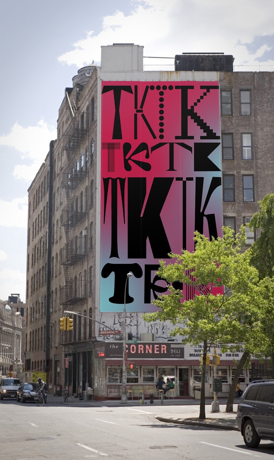
Wordmark:
The wordmark is simple, clean and references the idea of many parts coming together to build the whole. We knew the group would have members from all walks of life — and from all over the world — so the colorful array of well crafted geometry was suggestive yet artistic.
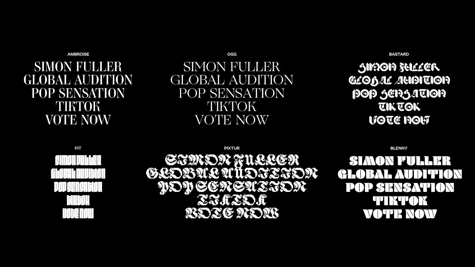
Type:
Using a host of typefaces allowed us to be really expressive while never compromising legibility. These could be used at all touch points and allowed us to really flex in motion. Cycling through our small army of typefaces allowed us to be clean and reductive (when communication was key) without sacrificing expression when type was used as a graphic element.

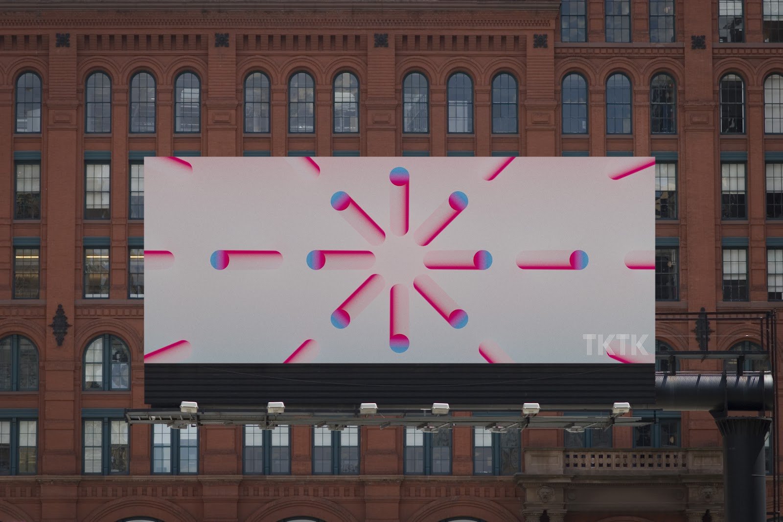
Color:
A system of gradients were used and could easily oscillate from light to dark and/or simple to complex. This allowed us to proactively build use cases and adjust the tone pending the placement.
We also built a super fun icon library used across the system. These were responsive and meant to be a growing set of graphics.


Illustration:
We saw illustration as a way to play up the mystery of the competition. Since we only knew how many members were going to be in the group but didn’t know who exactly, we developed a dark/light system for illustration. Characters were displayed in deep shadows to indicate numbers and once voted in by fans would get revealed.